Inception WINE PACK UPGRADE
PACKAGING DESIGN | ILLUSTRATION
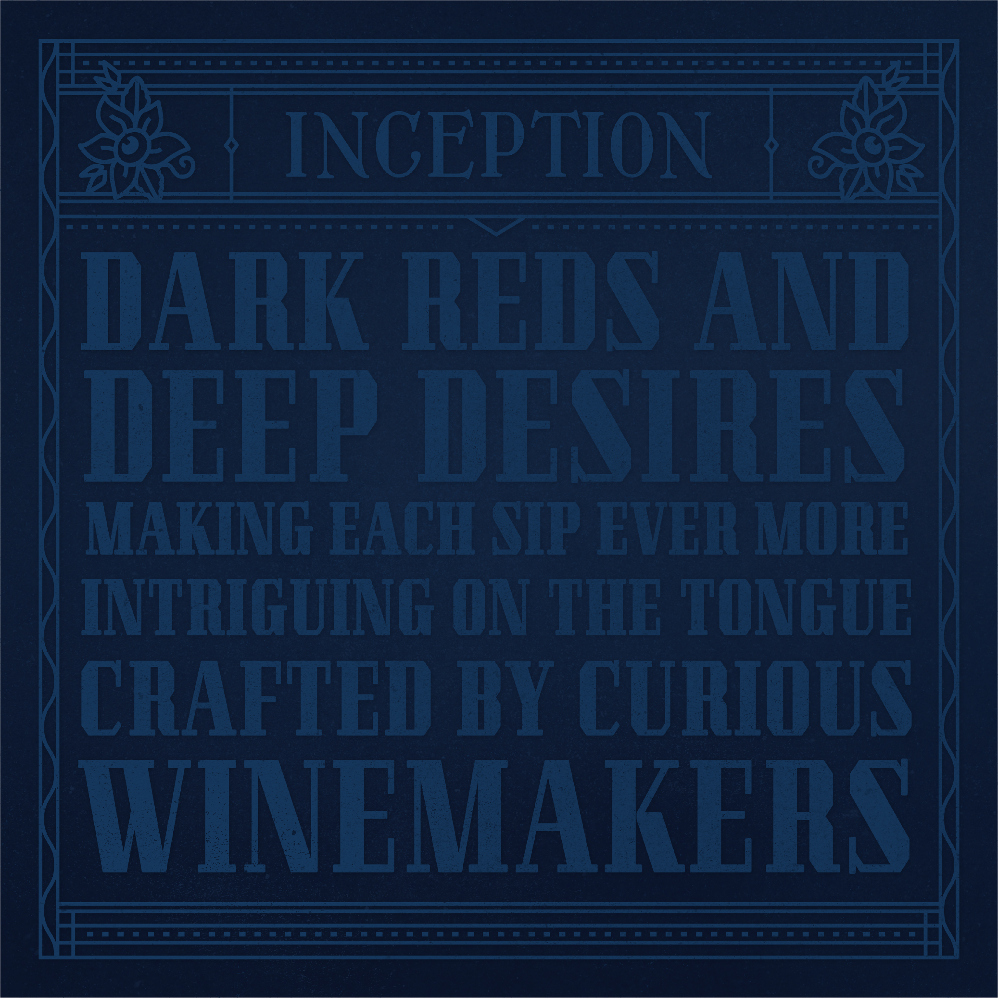
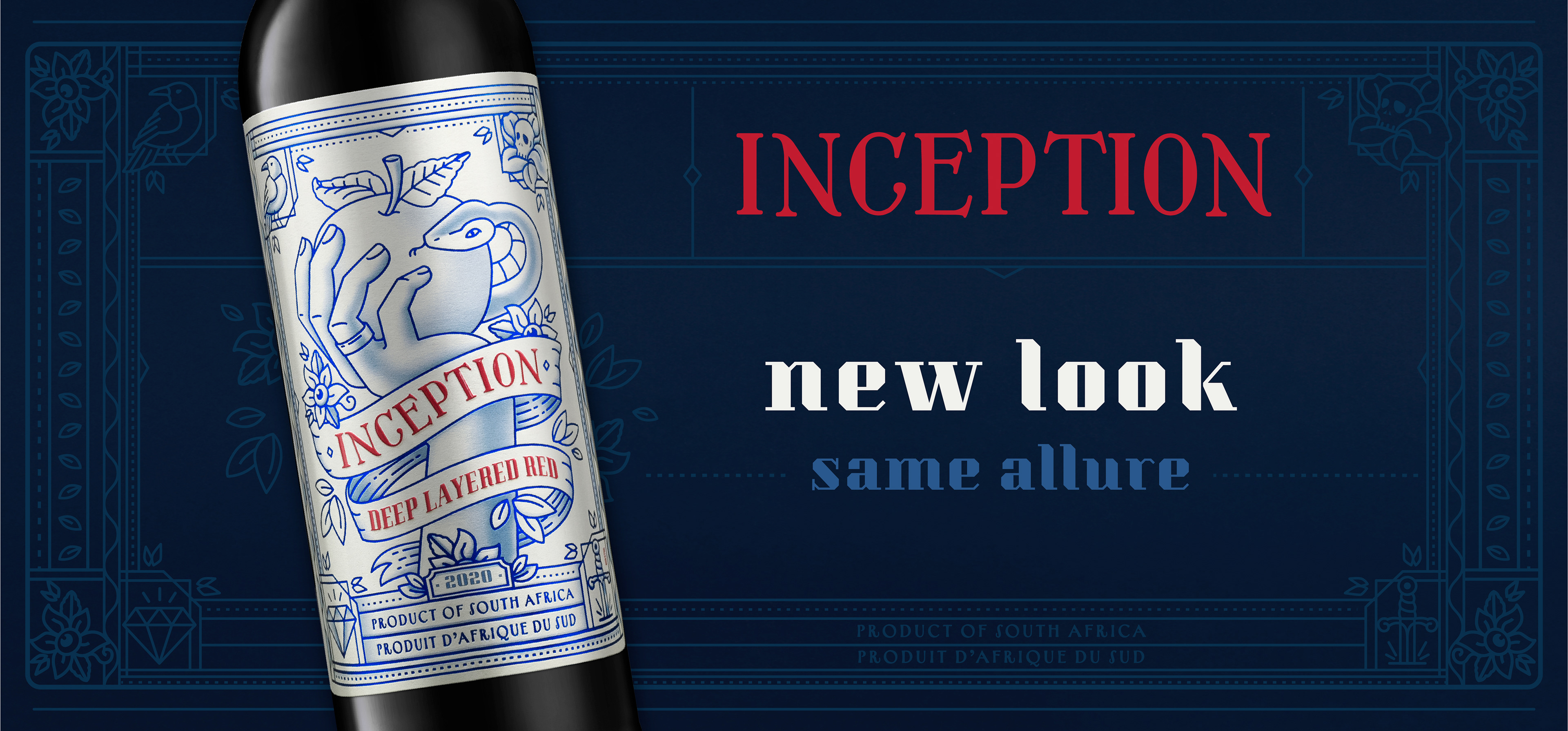
Inception Deep Layered Red – a packaging creation story.
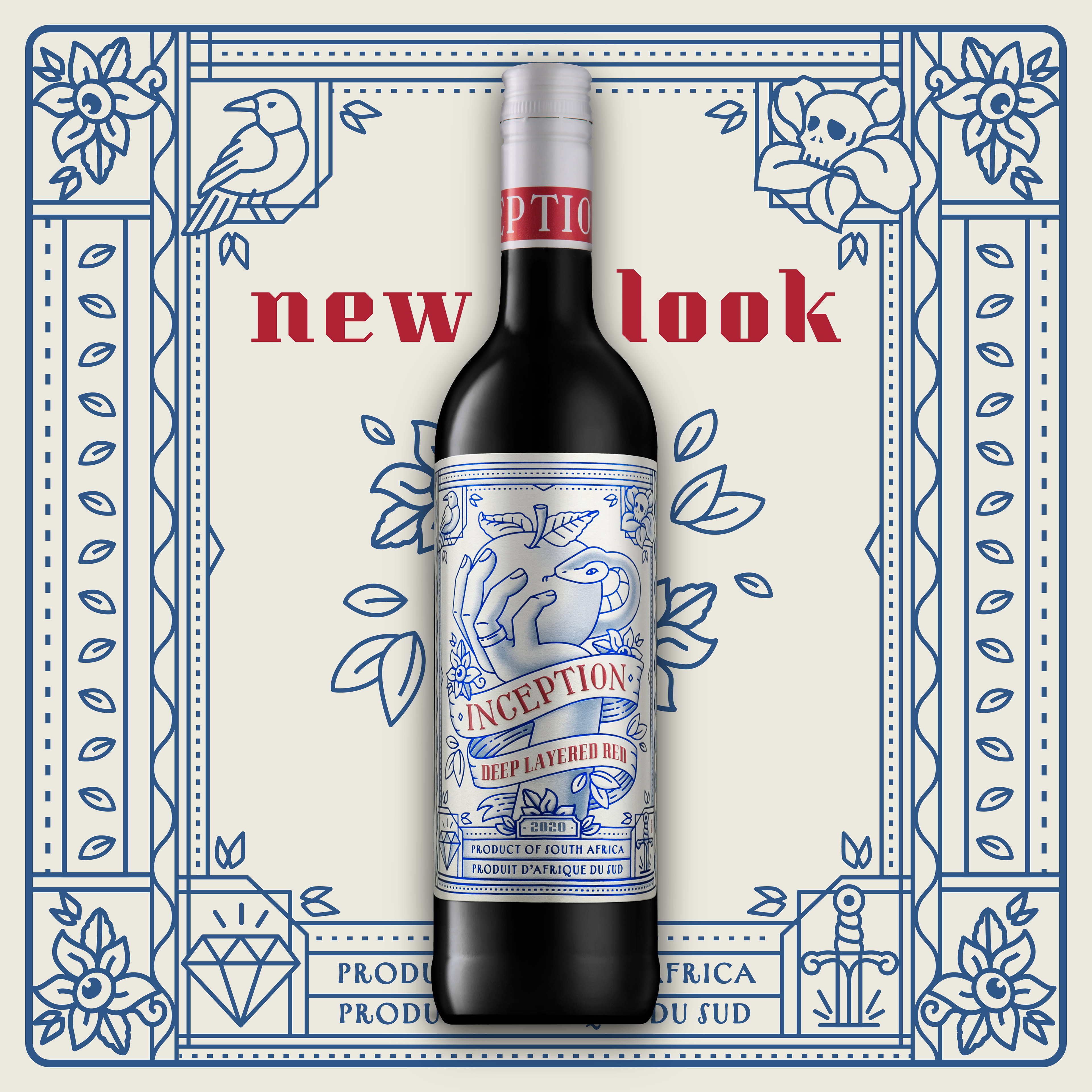
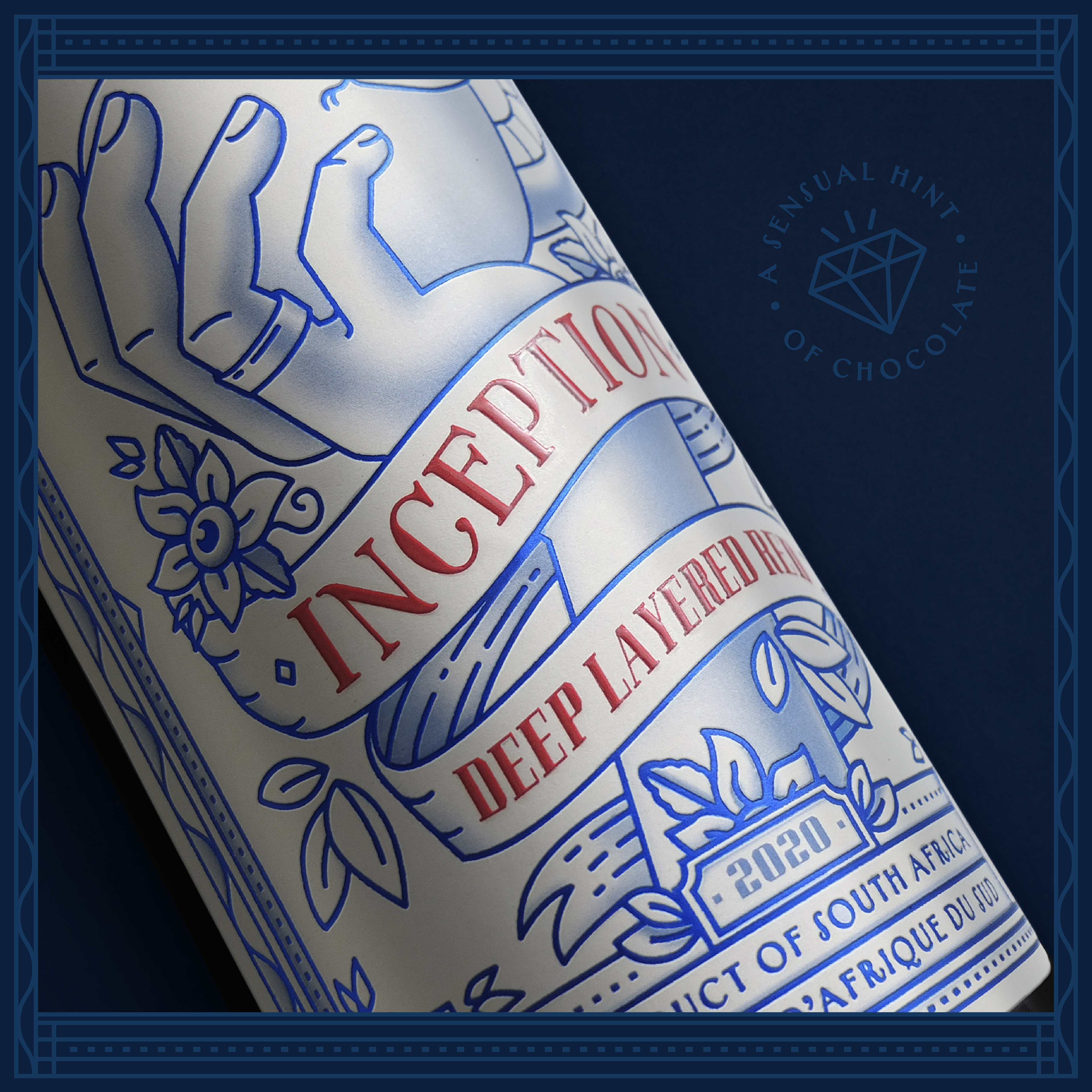
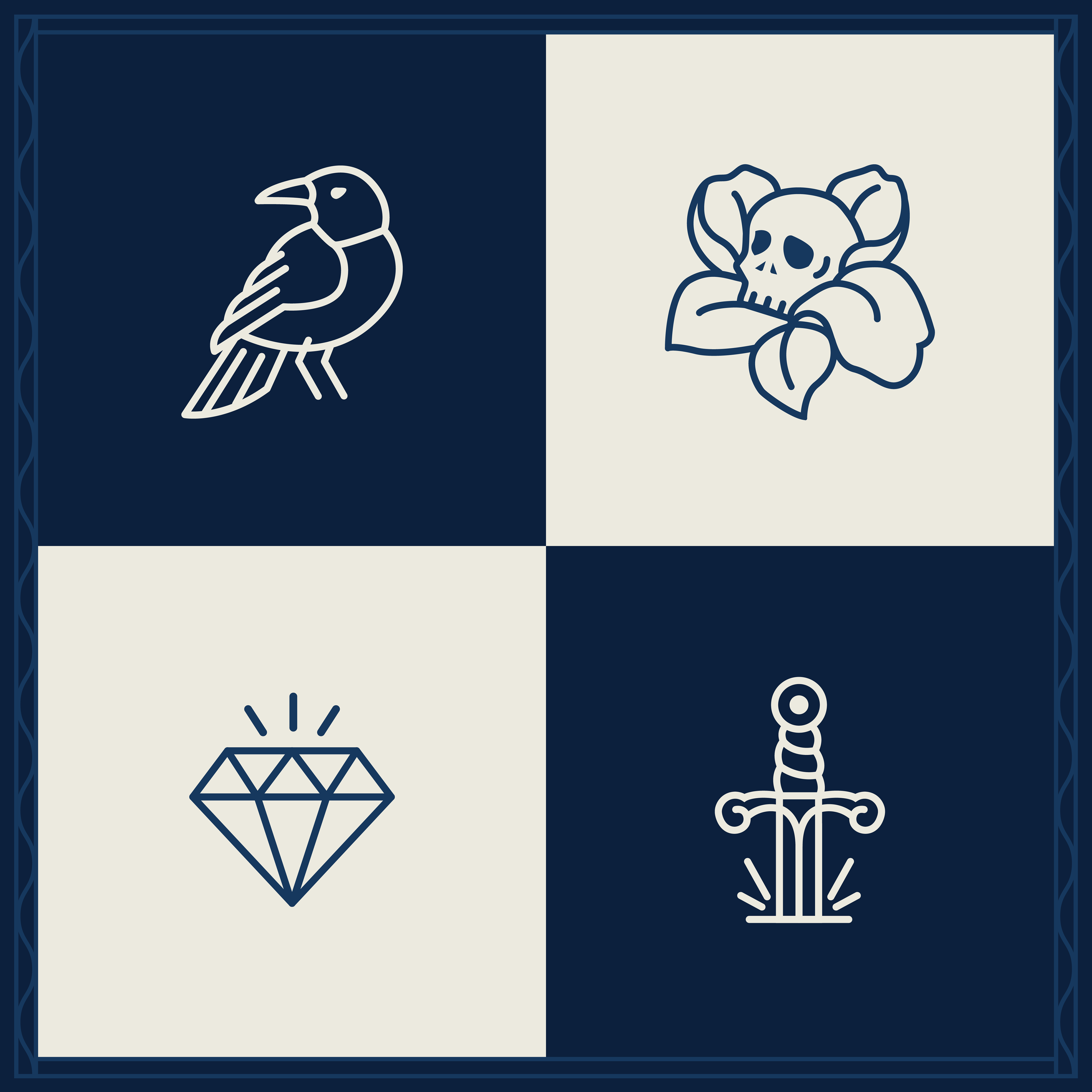
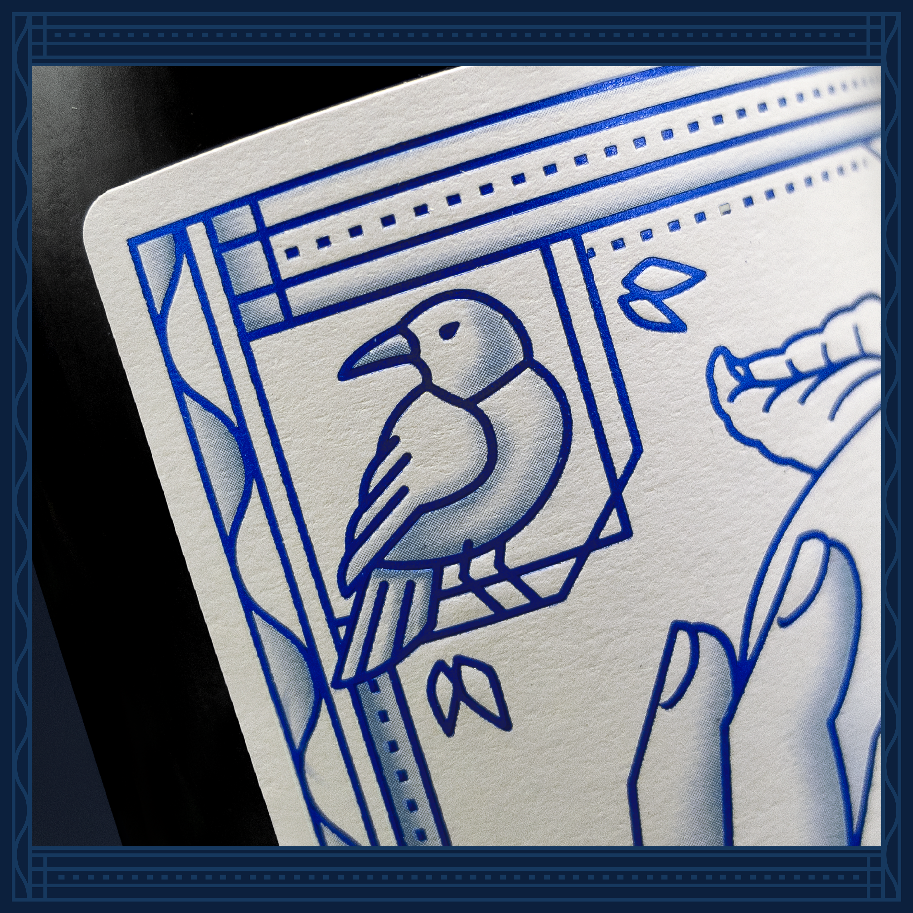
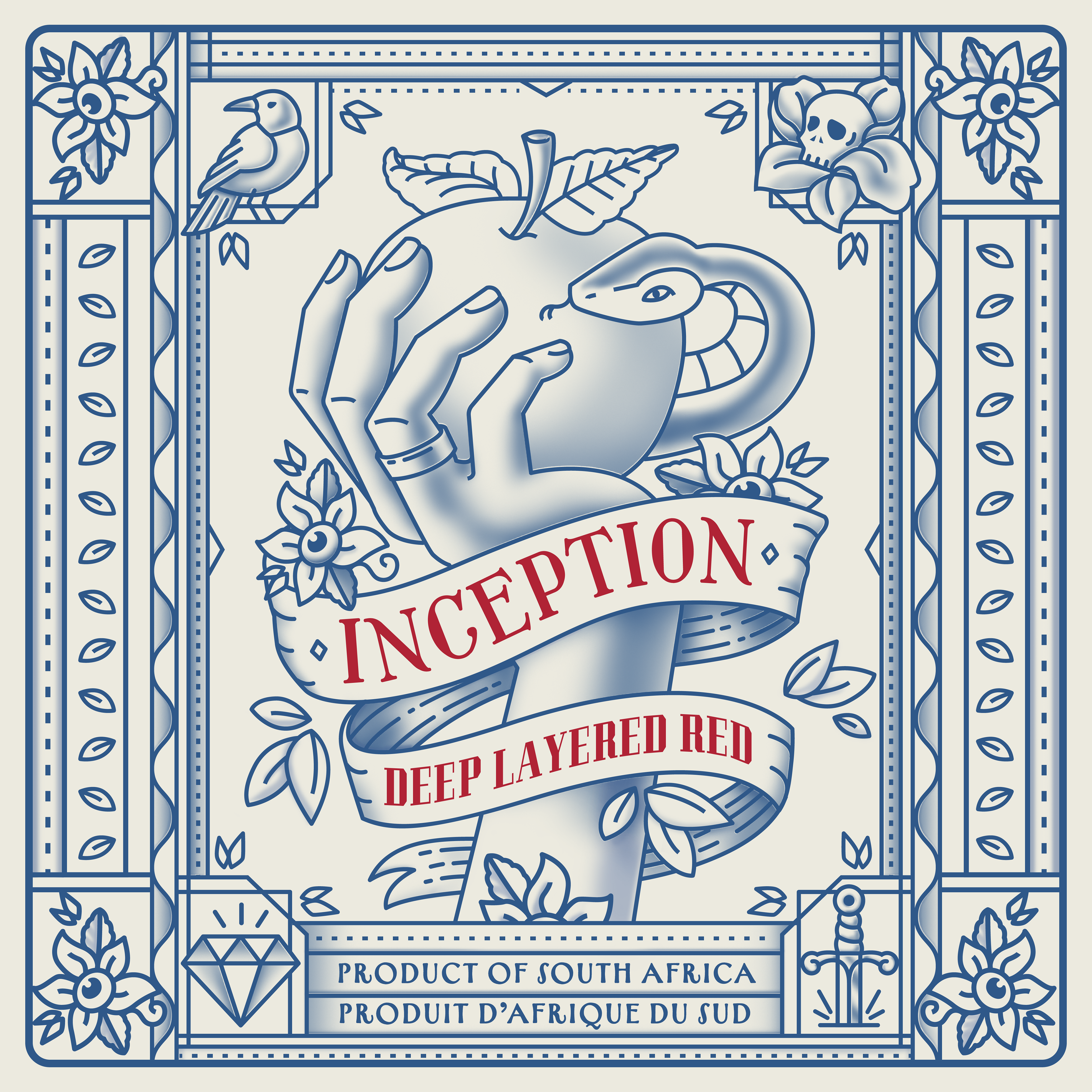
Many moons ago, when Inception was first launched, it was ahead of the pack: a tattoo-esque fully foiled illustration of a naked couple & a snake on a wine label. It raised some eyebrows and fitted a growing trend for dark, mysterious brands. However, the main theme (the story of creation) was somewhat lost in the detail and this brand needed some new news. Our all-new illustration cut right to the core of the concept. We pushed tattoo art further with the addition of shading to the crisp foiled outline. The intricate border was recrafted tarot card-style, complete with evocative symbols adding further mystery and nuance (and a little humour). Bring your own dark interpretations to the blackbird, the skull, the sword, the all-seeing flower and the diamond.
Many moons ago, when Inception was first launched, it was ahead of the pack: a tattoo-esque fully foiled illustration of a naked couple & a snake on a wine label. It raised some eyebrows and fitted a growing trend for dark, mysterious brands. However, the main theme (the story of creation) was somewhat lost in the detail and this brand needed some new news. Our all-new illustration cut right to the core of the concept. We pushed tattoo art further with the addition of shading to the crisp foiled outline. The intricate border was recrafted tarot card-style, complete with evocative symbols adding further mystery and nuance (and a little humour). Bring your own dark interpretations to the blackbird, the skull, the sword, the all-seeing flower and the diamond.
We are proud to unveil the evolution of Deep Layered Red.