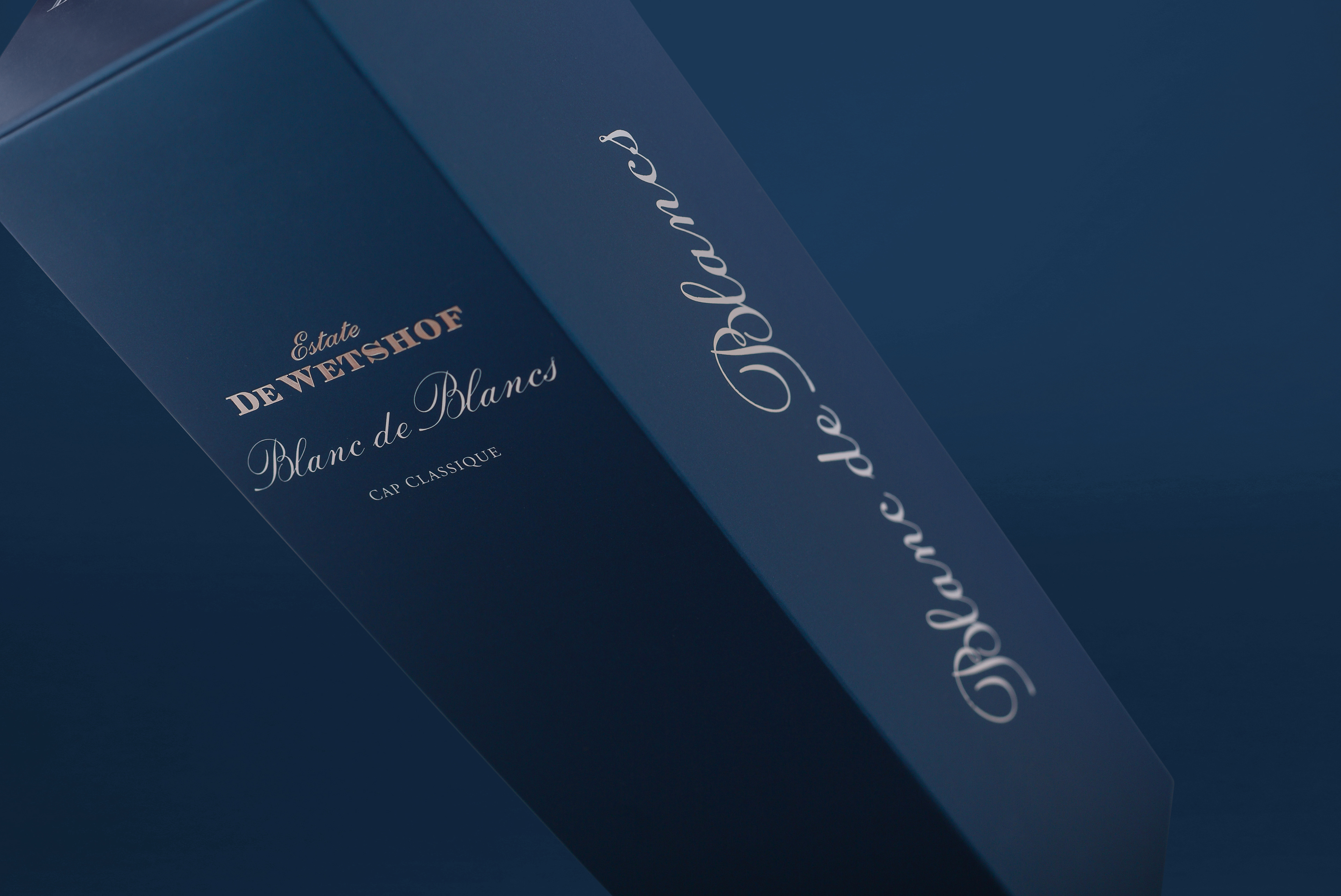

DE WETSHOF CAP CLASSIQUE
GIFT BOX DESIGN | WINE LABEL DESIGN
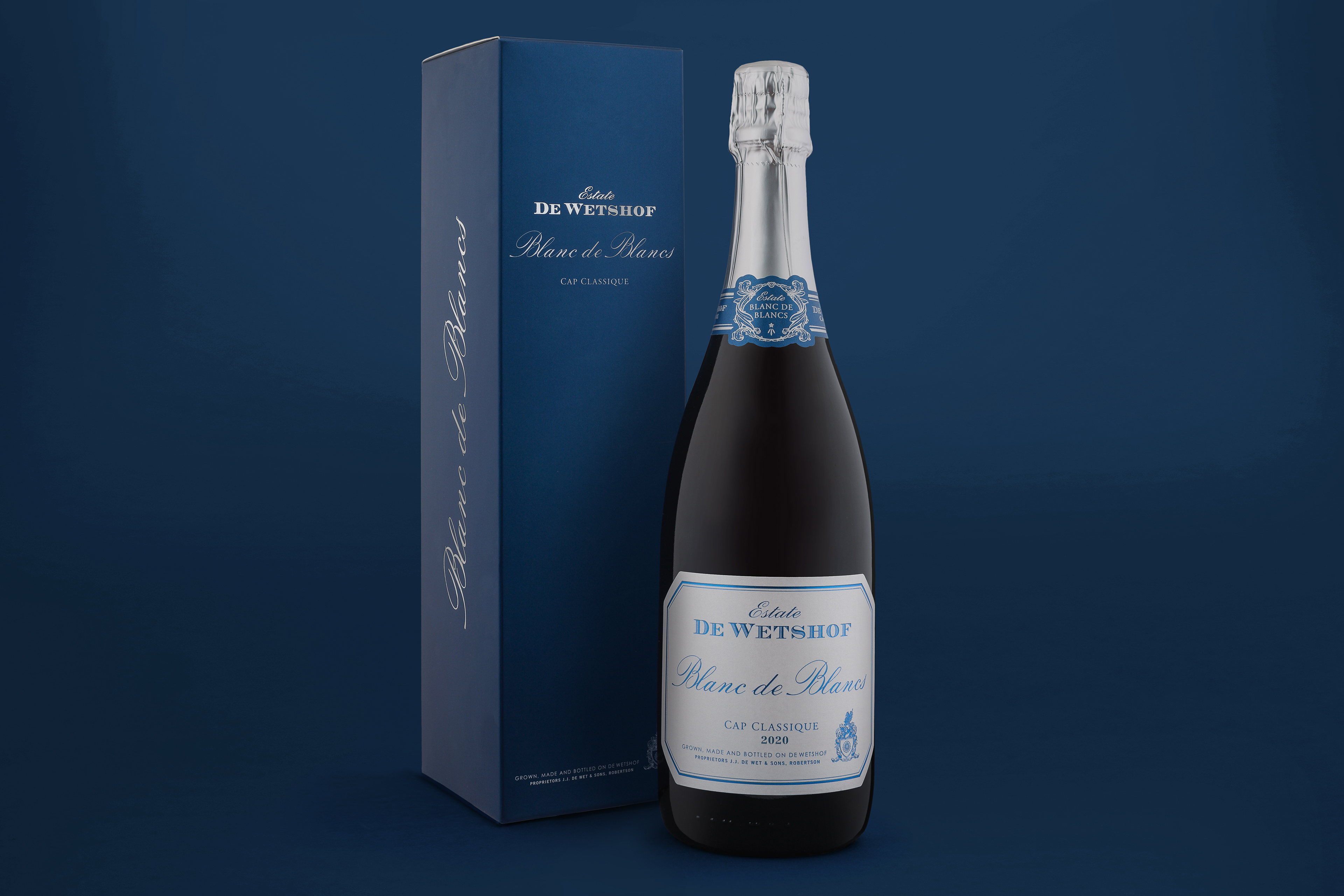
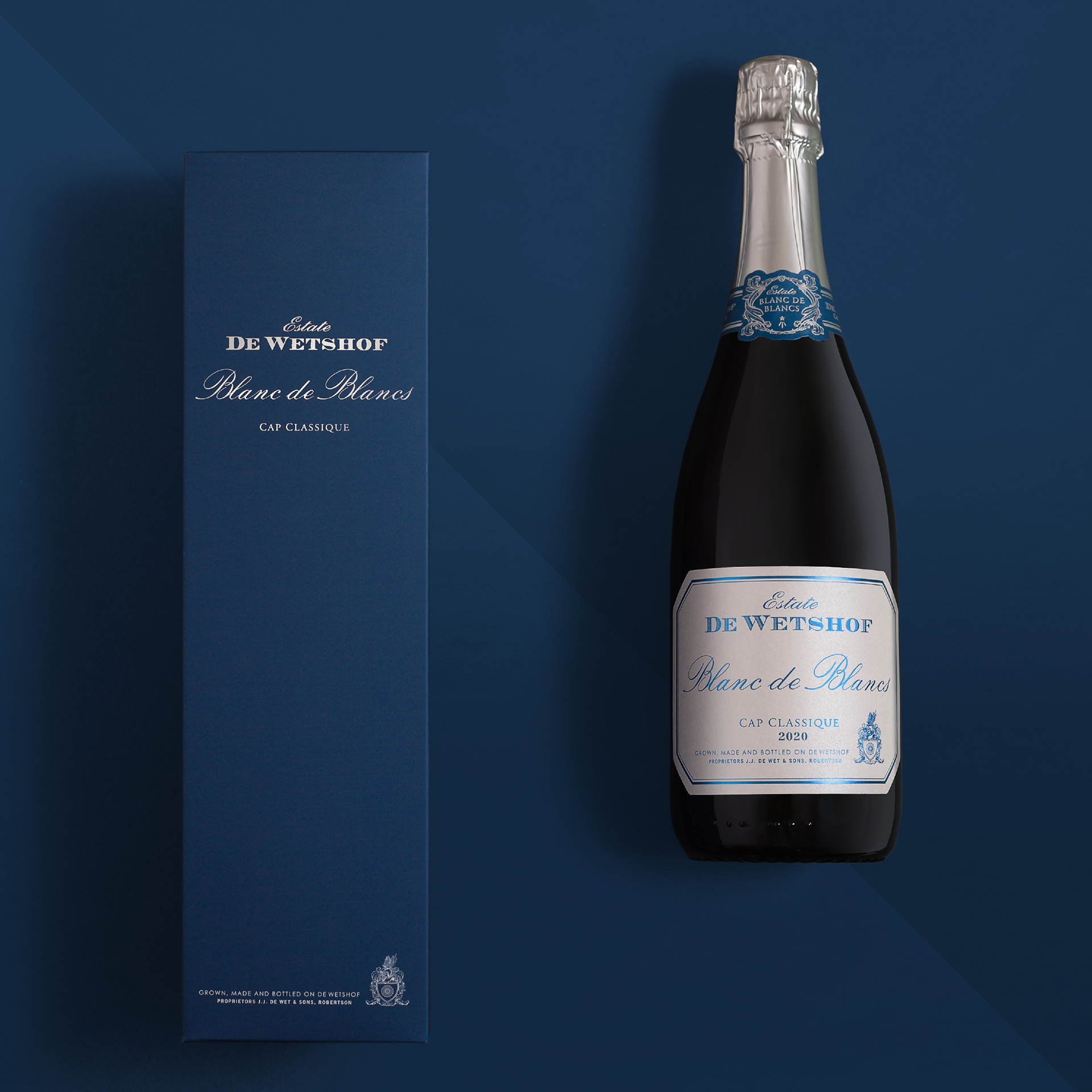
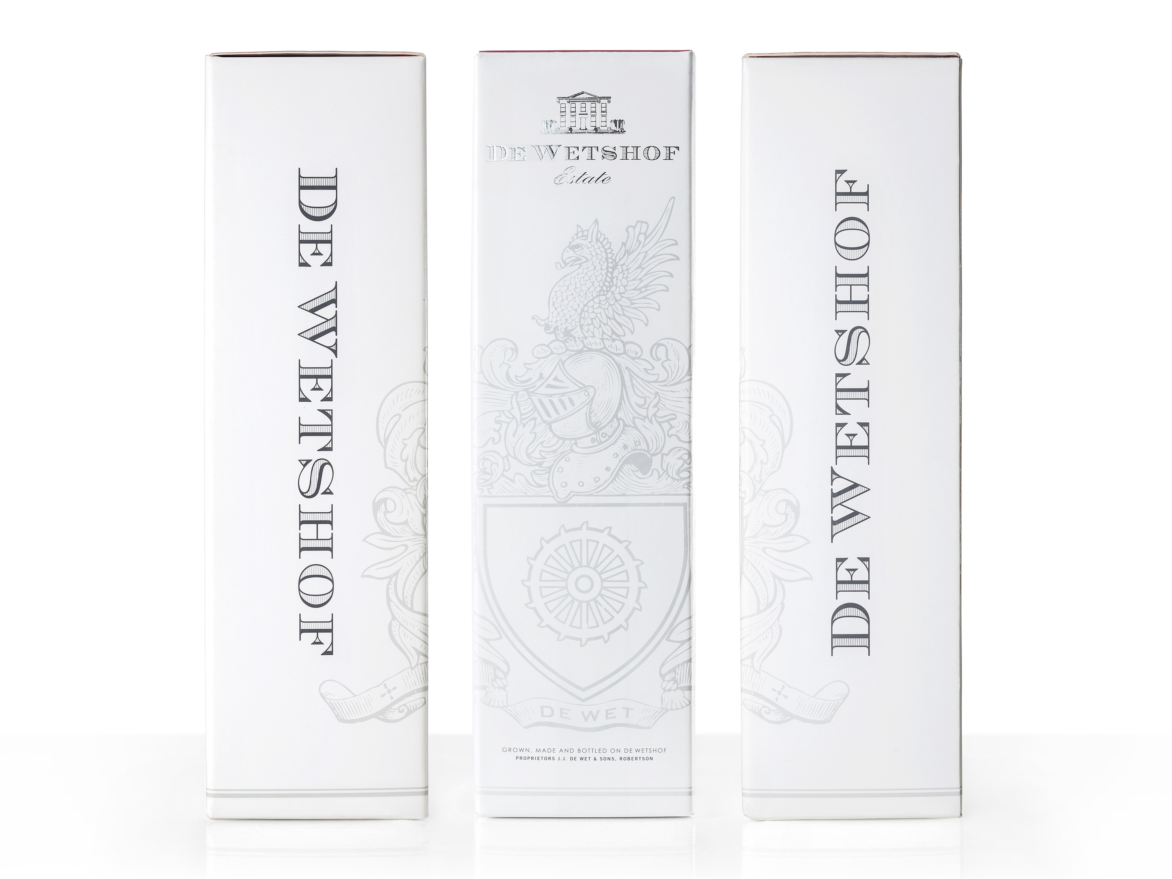
De Wetshof, South Africa’s eminent Chardonnay house, recently briefed our team to design the packaging for the release of their eagerly anticipated 100% Chardonnay Blanc de Blancs. The pack was to be aligned with the classic design language for the De Wetshof Chardonnay range, with the addition of design cues honouring the MCC category, with trademark De Wetshof understatement.
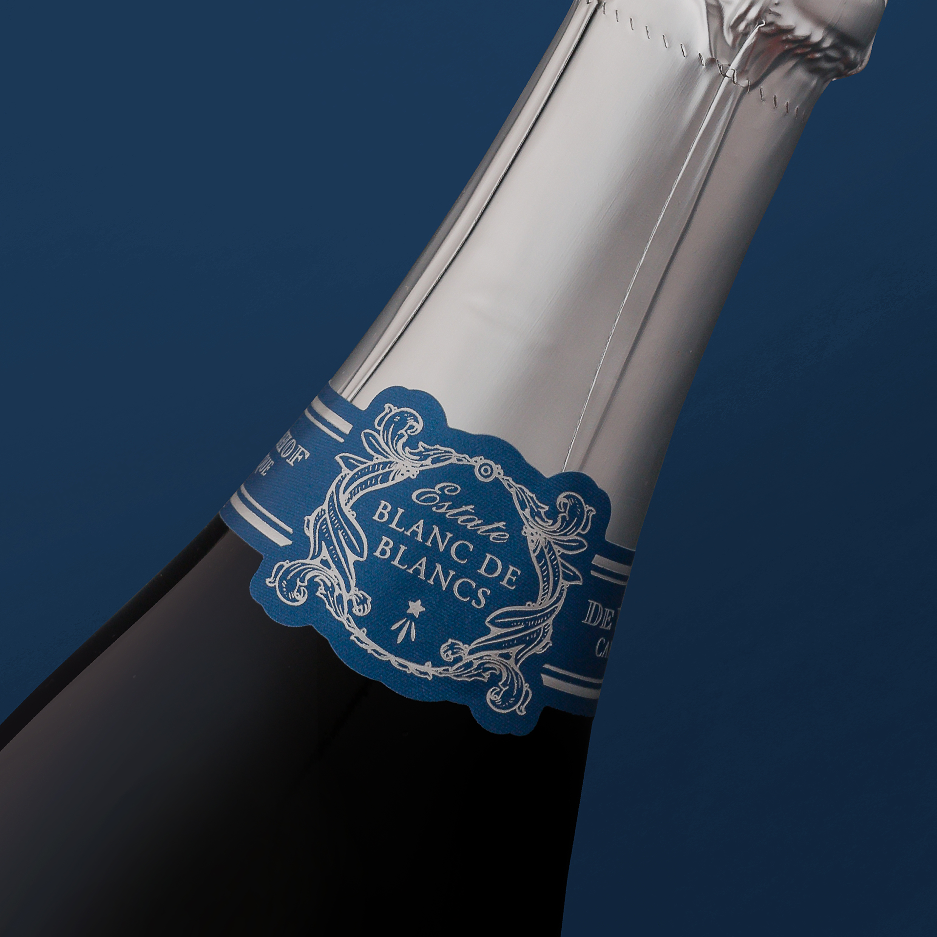
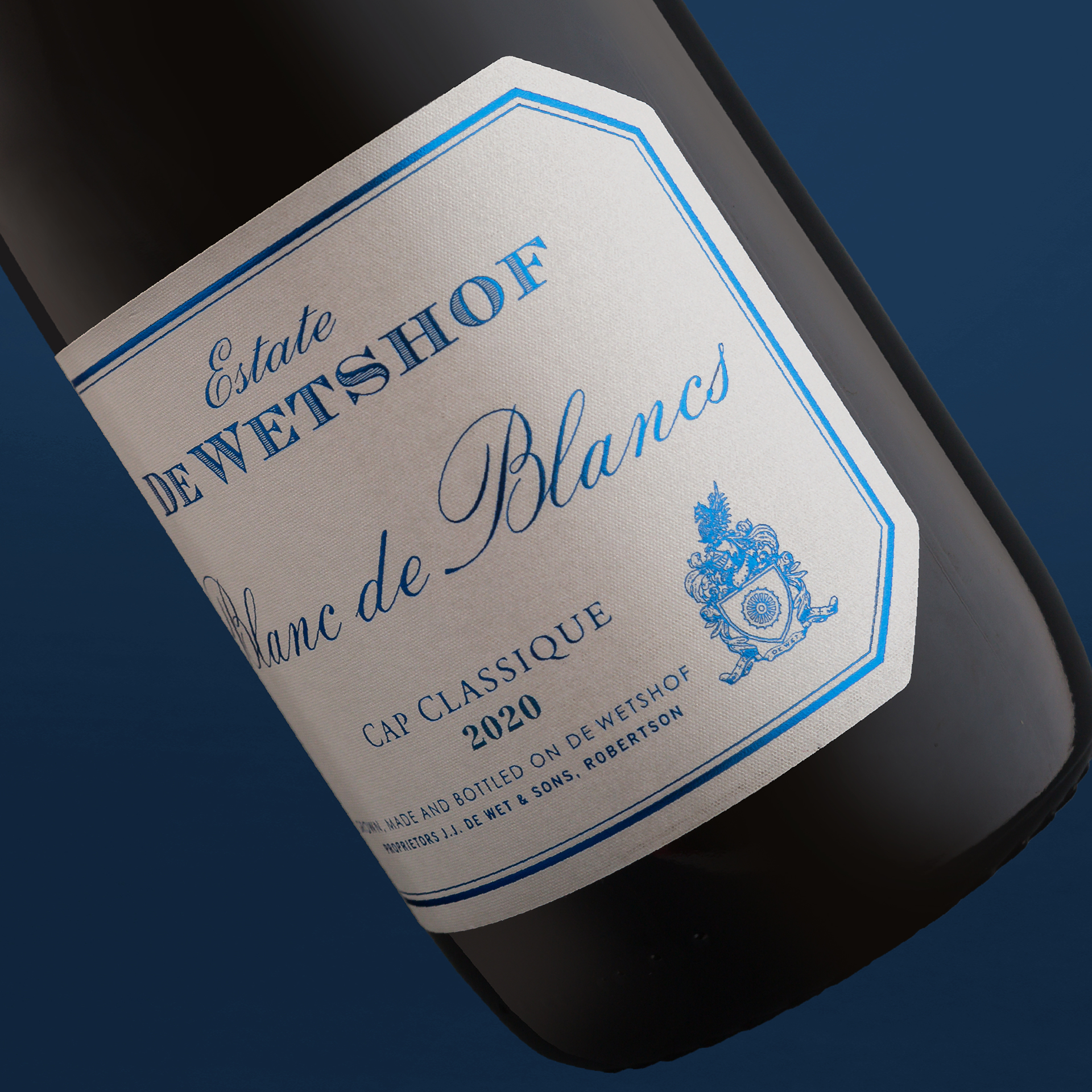
The classic, cool linear design has a masculine edge, softened by the script font and delicate linework in the necker, which was inspired by the De Wetshof family crest. MCC celebratory category cues are honoured with bright blue foil on the body label, set off against crisp silver on the necker and closure. Textured Jade Raster label paper brings a suitably celebratory effervescence in hand.
The De Wetshof Blanc de Blancs won a Gold Medal at the Amorim Cap Classique Challenge.