The saints
VISUAL IDENTITY | POS DESIGN
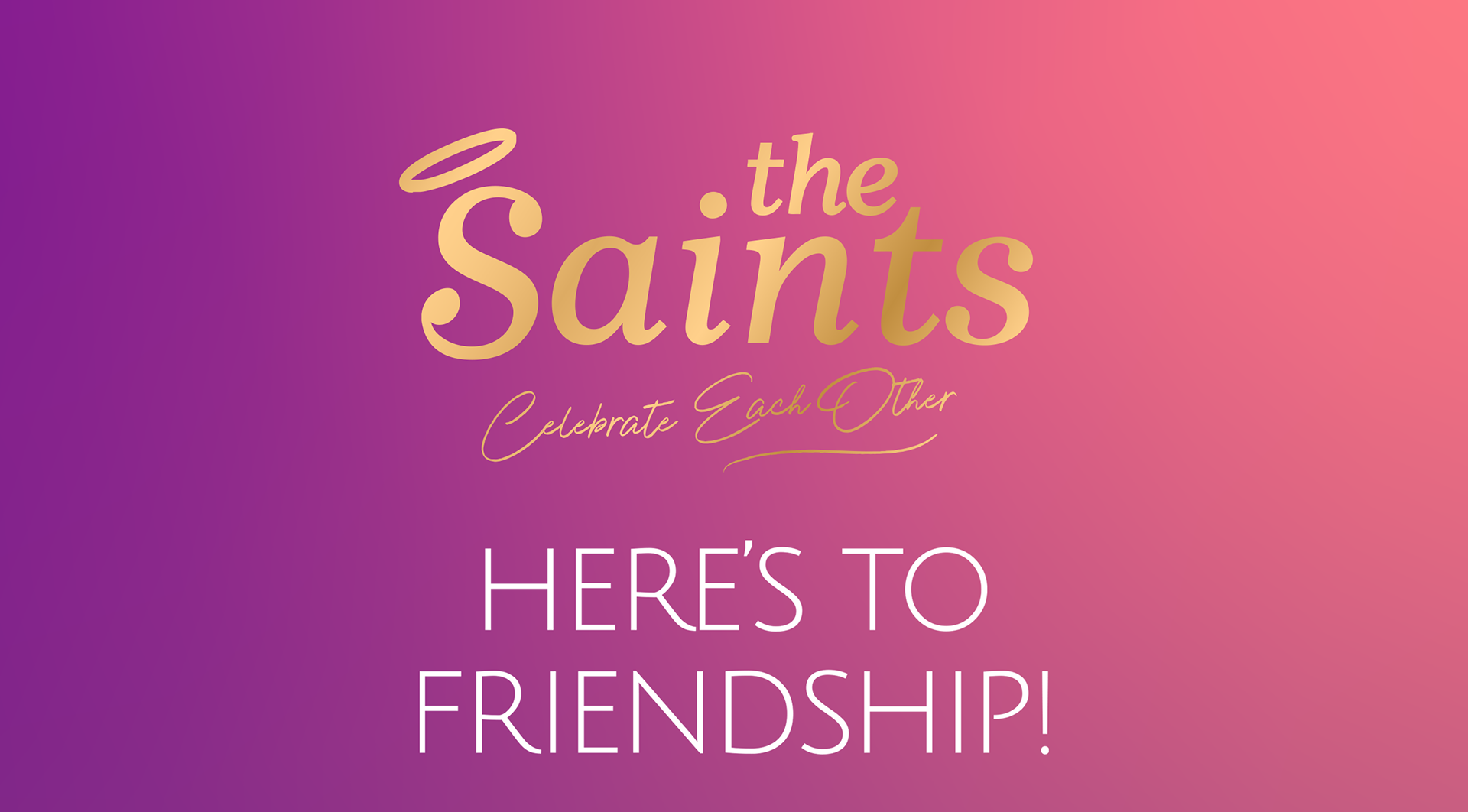
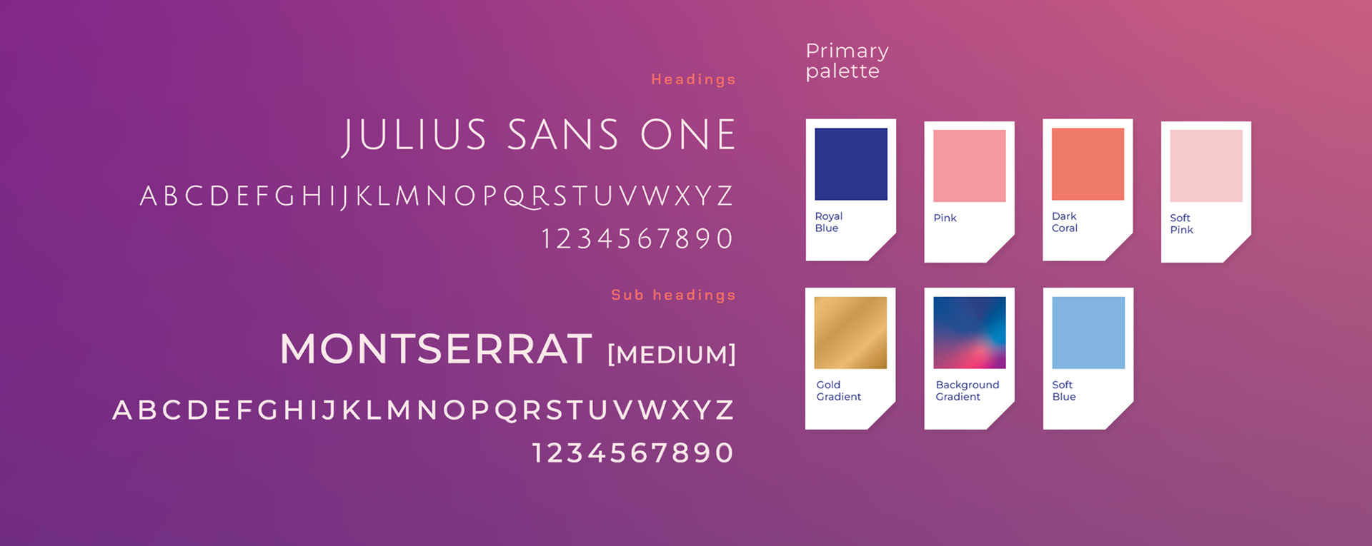
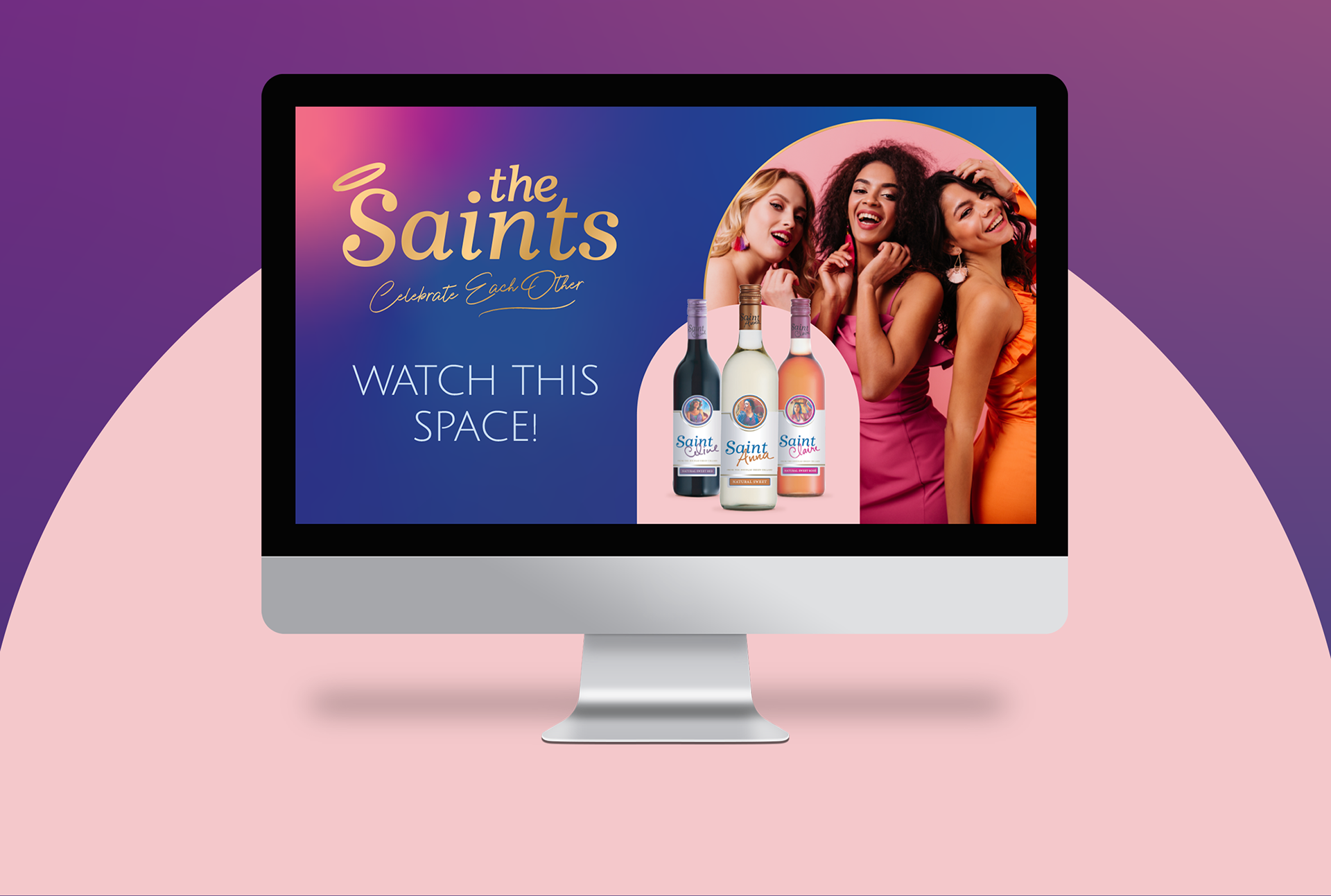
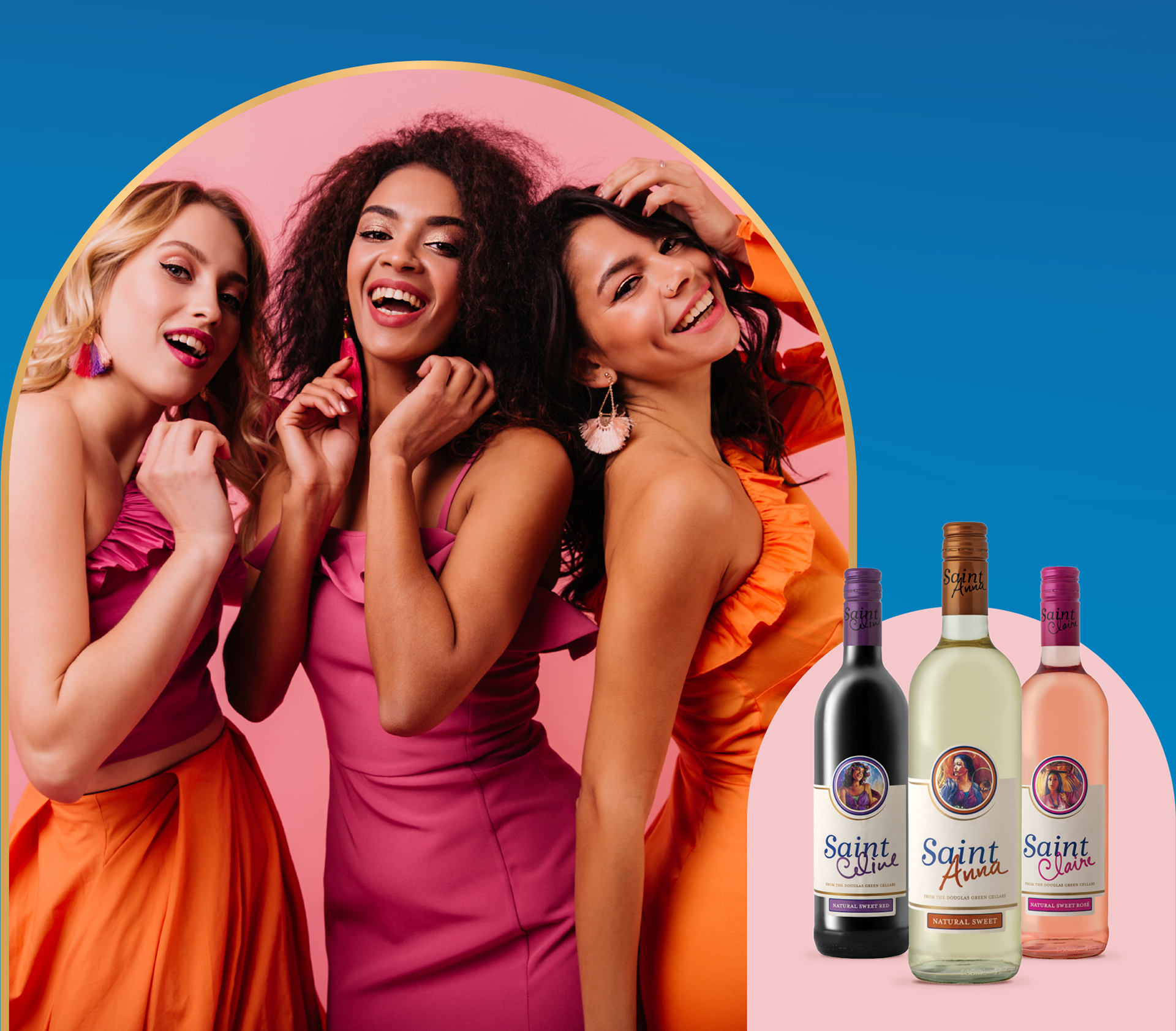
A brand new fresh & friendly look for Saints! Cast your mind to the indispensable LBD: the Saints visual identity had to embody the same versatility – your perfect companion from pretty baby shower vibes to glitzy night at the casino. Taking cues from shapes within the label, we created the arched holding shape. The soft & pretty colour palette has a touch of gold lux. We modernised the corporate blue brand colour with the addition of an on-trend pink & purple gradient. Contemporary sans serif font styles complete the look.